Summarize introduction, spread, prevalence, and persistence
Elias Rosenblatt
Source:vignettes/Visualize_by_context.Rmd
Visualize_by_context.RmdIntroduction
This vignette demonstrates how to manipulated, summarize, and plot
key results from the projection of SARS-CoV-2 infections in simulated
white-tailed deer populations. Now that we have a dataset from our
simulations in the vignettes detailing continuous introduction from
humans and a
single, initial introduction without continuous introduction from
humans, we can begin to visualize how various characteristics of
outbreaks differ between contexts. Here, we load the data set
whitetailedSIRS::scenario_results summarizing each
simulation (df), the data set
whitetailedSIRS::scenario_projections containing daily
compartment sizes for each simulation (outbreaks), and remind R how many
iterations were run in each context (nsamples). These figures are used
in the results published in Rosenblatt et al. In Prep.. The
tasks demonstrated in this vignette include:
Load data
Plot Force-Of-Infection, Hazard infection rate, and \(R_0\)
Plot projected infections for each scenario
Plot prevalence, persistence, and incidence proportions for each scenario
Plot interaction between FOI and \(R_0\) influencing prevalence, persistence, and incidence proportion
Plot comparison of continuous introduction from humans and a single introductory event
Load data
whitetailedSIRS comes with the simulation results reported in Rosenblatt et al. (In Prep), which we load to illustrate the visualization of outbreak dynamics. We load the scenario results that report various outbreak metrics for each iteration in each scenario (df).
df <- whitetailedSIRS::scenario_results
head(df)
#>   run_id       Context Setting        r0          FOI   Prevalence Persist
#> 1      1 Outdoor ranch Captive 0.5759082 1.206766e-05 1.496863e-04   FALSE
#> 2      2 Outdoor ranch Captive 2.2880165 1.100910e-06 5.116754e-02    TRUE
#> 3      3 Outdoor ranch Captive 1.7496298 8.404190e-07 3.454571e-02    TRUE
#> 4      4 Outdoor ranch Captive 0.1194827 6.995264e-07 4.478227e-06   FALSE
#> 5      5 Outdoor ranch Captive 3.4174119 3.525856e-05 5.080800e-02    TRUE
#> 6      6 Outdoor ranch Captive 0.4336174 1.043374e-04 9.895566e-04    TRUE
#>   Cumulative_infections
#> 1          3.174545e-03
#> 2          1.043574e+00
#> 3          7.274272e-01
#> 4          9.468253e-05
#> 5          1.026015e+00
#> 6          2.094289e-02
We also load the daily compartment sizes for each itneration in each scenario (scenario_projections).
outbreaks <- whitetailedSIRS::scenario_projections
head(outbreaks)
#> # A tibble: 6 × 3
#>   Context       run_id ode_proj
#>   <chr>          <int> <list>
#> 1 Outdoor ranch      1 <deSolve [121 × 9]>
#> 2 Outdoor ranch      2 <deSolve [121 × 9]>
#> 3 Outdoor ranch      3 <deSolve [121 × 9]>
#> 4 Outdoor ranch      4 <deSolve [121 × 9]>
#> 5 Outdoor ranch      5 <deSolve [121 × 9]>
#> 6 Outdoor ranch      6 <deSolve [121 × 9]>
head(outbreaks$ode_proj[[1]])
#>      time S_wild I_wild R_wild I_wild_cumulative S_captive    I_captive
#> [1,]    0      0      0      0                 0 1.0000000 0.000000e+00
#> [2,]    1      0      0      0                 0 0.9999874 1.165563e-05
#> [3,]    2      0      0      0                 0 0.9999737 2.251533e-05
#> [4,]    3      0      0      0                 0 0.9999590 3.263340e-05
#> [5,]    4      0      0      0                 0 0.9999435 4.205442e-05
#> [6,]    5      0      0      0                 0 0.9999271 5.083445e-05
#>         R_captive I_captive_cumulative
#> [1,] 0.000000e+00         0.000000e+00
#> [2,] 9.675493e-07         1.262698e-05
#> [3,] 3.796539e-06         2.633439e-05
#> [4,] 8.344705e-06         4.104836e-05
#> [5,] 1.449544e-05         5.670830e-05
#> [6,] 2.210210e-05         7.323797e-05
Finally, we set the number of iterations (nsamples) to match that of these stored datasets (nsample = 1000)
nsamples <- 1000Plot Force-Of-Infection, Hazard infection rate, and \(R_0\)
We summarize the Force-Of_Infection from humans to deer (\(FOI_{HD}\)), the hazard probability of at least 1 deer infected per 1000 deer during the 120-day simulation, and the basic reproductive number (\(R_0\)) and for each scenario below, producing Figure 3 in Rosenblatt et al. In Prep.:
#plot r0
ggplot(df, aes(x = Context, y = r0)) +
  geom_boxplot(width = 0.5)+
  theme_classic()+
  geom_hline(yintercept = 1)+
   coord_cartesian(ylim = c(0,20))+
  scale_y_continuous("Basic reproductive number (R0)")+
  theme(axis.text = element_text(size = 10), axis.title = element_text(size = 12),legend.text = element_text(size = 12), legend.title = element_text(size = 14), strip.text.x = element_text(size = 14), axis.title.x = element_blank(), axis.text.x = element_text(angle = 90, size = 12)) -> r0

#plot FOI
ggplot(df, aes(x = Context, y = log10(FOI*100))) +
  geom_boxplot(width = 0.5)+
  theme_classic()+
    coord_cartesian(ylim = c(-9,0))+
  scale_y_continuous("Percent susceptible deer infected\nby humans per day (FOI; log-10 scale)", breaks = c(-9,-6,-3,-1))+
  theme(axis.text = element_text(size = 10), axis.title = element_text(size = 12),legend.text = element_text(size = 12), legend.title = element_text(size = 14), strip.text.x = element_text(size = 14), axis.title.x = element_blank(), axis.text.x = element_text(angle = 90, size = 12)) -> FOI

#Plot P>=1 infection out of 100
ggplot(df, aes(x = Context, y = 1-(exp(-FOI*120))^1000)) +
  geom_boxplot(width = 0.5)+
  theme_classic()+
  scale_y_continuous("Probability of at least 1 HtD transmission\nper 1000 deer during 120-day projection", limits = c(0,1))+
  theme(axis.text = element_text(size = 10), axis.title = element_text(size = 12),legend.text = element_text(size = 12), legend.title = element_text(size = 14), strip.text.x = element_text(size = 14), axis.title.x = element_blank(), axis.text.x = element_text(angle = 90, size = 12)) -> pinfect

ggpubr::ggarrange(FOI, pinfect ,r0, nrow =1, ncol=3)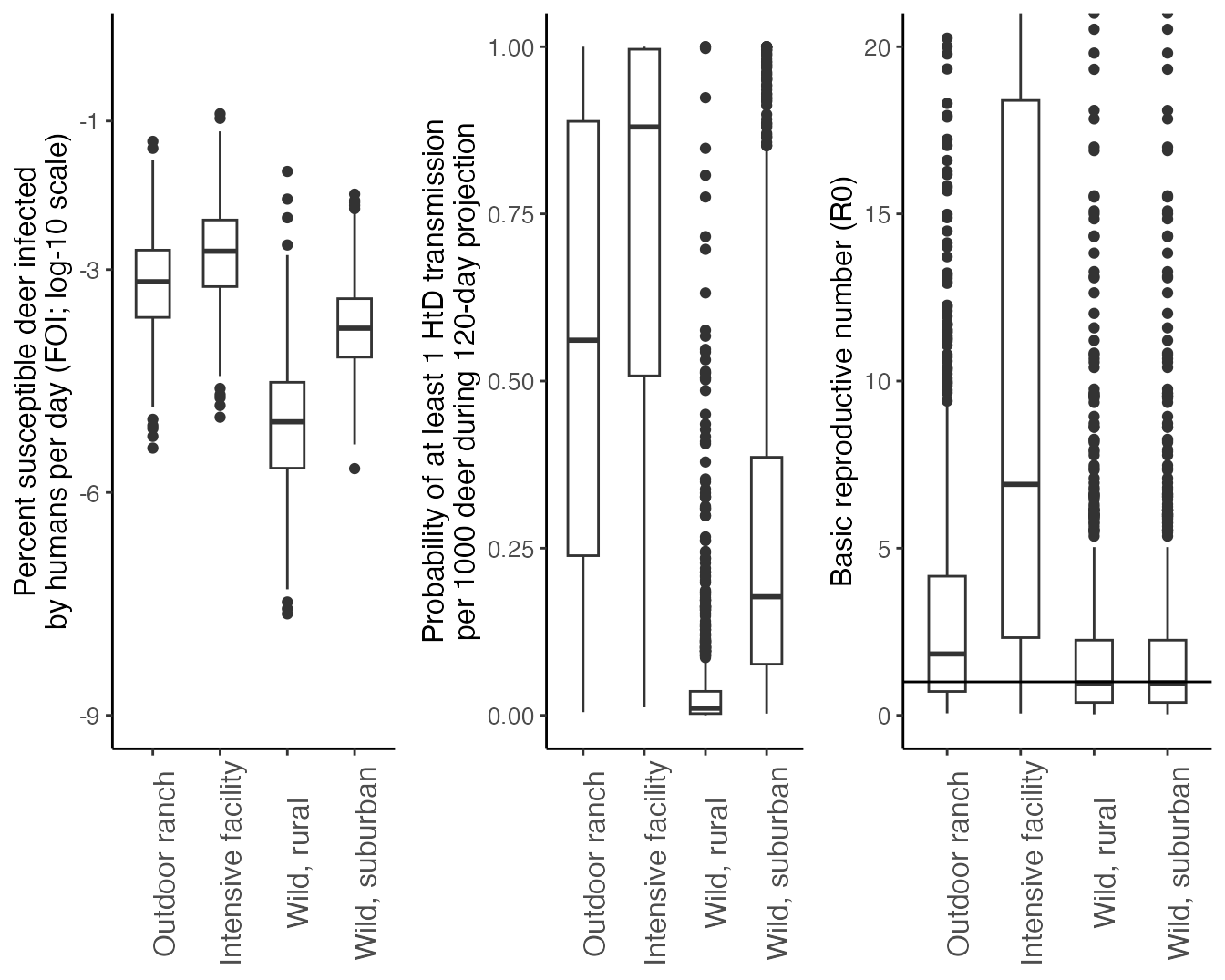
Plot projected infections for each scenario
We can visually compare the distribution of outbreak frequency, and peak size and timing across the four scenarios considered. This figure is not featured in Rosenblatt et al. (In Prep.), but may be of interest for the user.
outbreaks %>%
   filter(., Context %in% c("Outdoor ranch")) %>%
   mutate(ode_df = map(ode_proj, as.data.frame)) %>%
   pull(ode_df) %>%
   list_rbind(names_to = "run_id") %>%
   filter(., run_id %in% sample(unique(.$run_id),200)) %>%
   ggplot(., aes(x = time, y = I_captive*100, group = run_id)) +
   geom_line(size = 0.1) +
   labs(x = "Time (days)", y = "Prevalence in captive deer (%)") +
   scale_y_continuous(limits = c(0,100))+
   scale_x_continuous(limits = c(0,120), breaks = c(0,30,60,90,120))+
   theme_classic()+
   theme(axis.title = element_text(size = 12),
         axis.text = element_text(size = 10),
         axis.title.x = element_blank(),
         axis.text.x = element_blank())+
   annotate("label", label  = "Outdoor ranch facility", x = 80, y = 60, size = 4) -> outdoor_ranch_outbreak
#> Warning: Using `size` aesthetic for lines was deprecated in ggplot2 3.4.0.
#> ℹ Please use `linewidth` instead.
#> This warning is displayed once every 8 hours.
#> Call `lifecycle::last_lifecycle_warnings()` to see where this warning was
#> generated.

outbreaks %>%
   filter(., Context %in% c("Intensive facility")) %>%
   mutate(ode_df = map(ode_proj, as.data.frame)) %>%
   pull(ode_df) %>%
   list_rbind(names_to = "run_id") %>%
   filter(., run_id %in% sample(unique(.$run_id),200)) %>%
   ggplot(., aes(x = time, y = I_captive*100, group = run_id)) +
   geom_line(size = 0.1) +
   labs(x = "Time (days)", y = "Prevalence in captive deer (%)") +
   scale_y_continuous(limits = c(0,100))+
   scale_x_continuous(limits = c(0,120), breaks = c(0,30,60,90,120))+
   theme_classic()+
   theme(axis.title = element_blank(),
         axis.text = element_blank())+
   annotate("label", label  = "Intensive facility", x = 80, y = 60, size = 4) -> intensive_facility_outbreak

outbreaks %>%
   filter(., Context %in% c("Wild, rural")) %>%
   mutate(ode_df = map(ode_proj, as.data.frame)) %>%
   pull(ode_df) %>%
   list_rbind(names_to = "run_id") %>%
   filter(., run_id %in% sample(unique(.$run_id),200)) %>%
   ggplot(., aes(x = time, y = I_wild*100, group = run_id)) +
   geom_line(size = 0.1) +
   labs(x = "Time (days)", y = "Prevalence in wild deer (%)") +
   scale_y_continuous(limits = c(0,100))+
   scale_x_continuous(limits = c(0,120), breaks = c(0,30,60,90,120))+
   theme_classic()+
   theme(axis.title = element_text(size = 12),
         axis.text = element_text(size = 10))+
   annotate("label", label  = "Wild deer in rural setting", x = 80, y = 60, size = 4) -> wild_rural_outbreak

outbreaks %>%
   filter(., Context %in% c("Wild, suburban")) %>%
   mutate(ode_df = map(ode_proj, as.data.frame)) %>%
   pull(ode_df) %>%
   list_rbind(names_to = "run_id") %>%
   filter(., run_id %in% sample(unique(.$run_id),200)) %>%
   ggplot(., aes(x = time, y = I_wild*100, group = run_id)) +
   geom_line(size = 0.1) +
   labs(x = "Time (days)", y = "Prevalence in captive deer (%)") +
   scale_y_continuous(limits = c(0,100))+
   scale_x_continuous(limits = c(0,120), breaks = c(0,30,60,90,120))+
   theme_classic()+
   theme(axis.title.x = element_text(size = 12),
         axis.text.x = element_text(size = 10),
         axis.title.y = element_blank(),
         axis.text.y = element_blank())+
   annotate("label", label  = "Wild deer in suburban setting", x = 80, y = 60, size = 4) -> wild_suburban_outbreak

ggpubr::ggarrange(outdoor_ranch_outbreak, intensive_facility_outbreak, wild_rural_outbreak, wild_suburban_outbreak)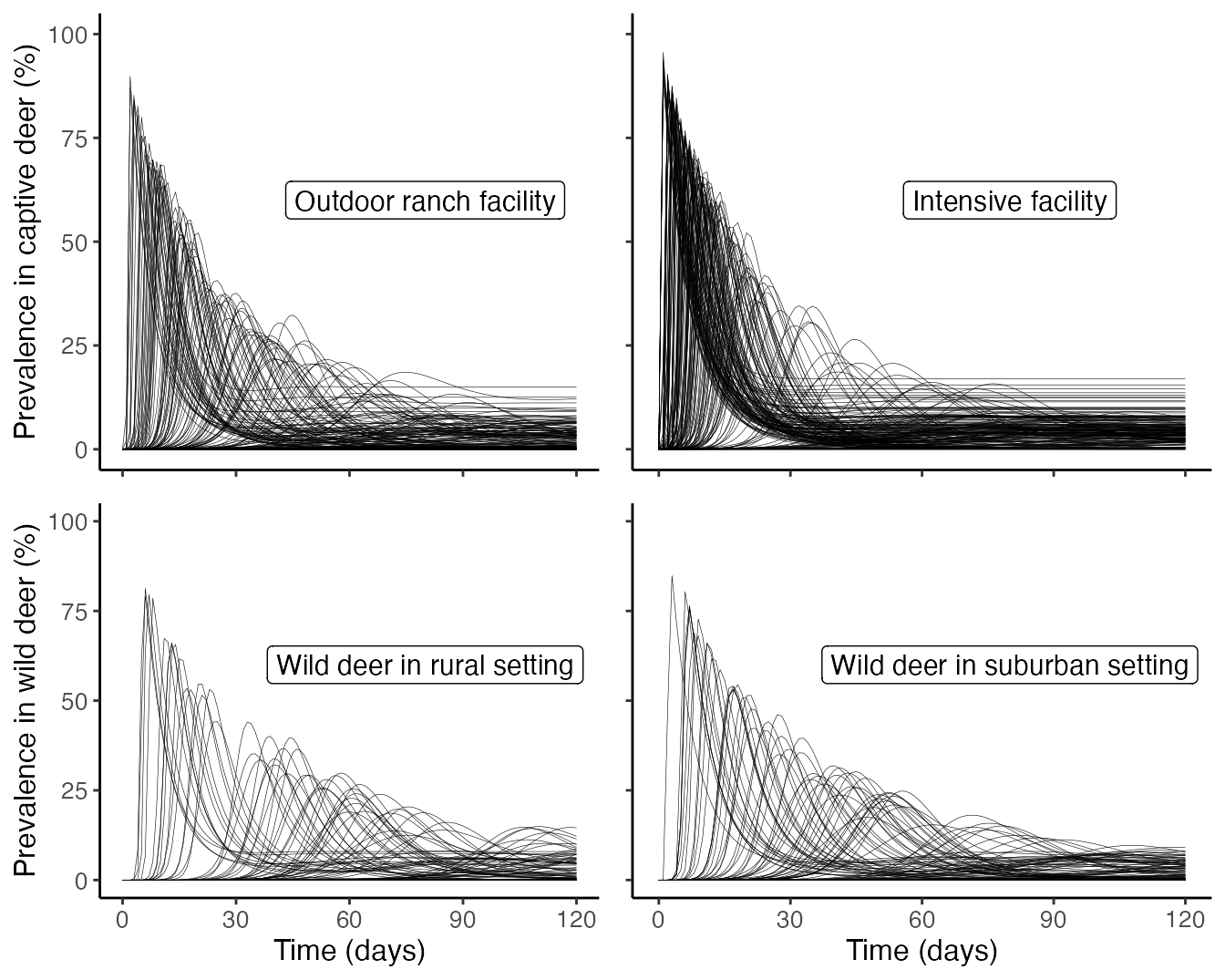
Plot prevalence, persistence, and incidence proportions for each scenario
We summarize the average prevalence, incidence proportion, and probability of persistence for each scenario below, producing Figure 4 in Rosenblatt et al. In Prep.:
ggplot(df, aes(x = Context, y = Prevalence*100)) +
  geom_boxplot(width = 0.5)+
  theme_classic()+
  scale_y_continuous("Average prevalence (%)")+
  theme(axis.text = element_text(size = 10), axis.title = element_text(size = 12),legend.text = element_text(size = 12), legend.title = element_text(size = 14), strip.text.x = element_text(size = 14), axis.title.x = element_blank(), axis.text.x = element_text(angle = 90, size = 12)) -> prevalence

#plot persistence
group_by(df, Context) %>%
  summarize(., Persistence = sum(Persist)) %>%
  mutate(LCL = binom.confint(Persistence, n = nsamples, methods = "exact")$lower, pred = binom.confint(Persistence, n = nsamples, methods = "exact")$mean ,UCL = binom.confint(Persistence, n = nsamples, methods = "exact")$upper) %>%
  mutate(Context = factor(Context, levels = c("Outdoor ranch", "Intensive facility", "Wild, rural","Wild, suburban"))) %>%
  ggplot(., aes(x = Context, y = pred))+
  geom_point()+
  geom_errorbar(aes(ymin = LCL, ymax = UCL), width = 0.5)+
  scale_fill_grey()+
  theme_classic()+
  scale_y_continuous("Probability of persistence", limits = c(0,1))+
  theme(axis.text = element_text(size = 10), axis.title = element_text(size = 12),legend.text = element_text(size = 12), legend.title = element_text(size = 14), strip.text.x = element_text(size = 14), axis.title.x = element_blank(), axis.text.x = element_text(angle = 90, size = 12)) -> persistence

ggplot(df, aes(x = Context, y = Cumulative_infections)) +
  geom_boxplot(width = 0.5)+
  theme_classic()+
  scale_y_continuous("Incidence proportion")+
  theme(axis.text = element_text(size = 10), axis.title = element_text(size = 12),legend.text = element_text(size = 12), legend.title = element_text(size = 14), strip.text.x = element_text(size = 14), axis.title.x = element_blank(), axis.text.x = element_text(angle = 90, size = 12)) -> incidence_proportion


ggpubr::ggarrange(prevalence, persistence,incidence_proportion,nrow =1, ncol=3)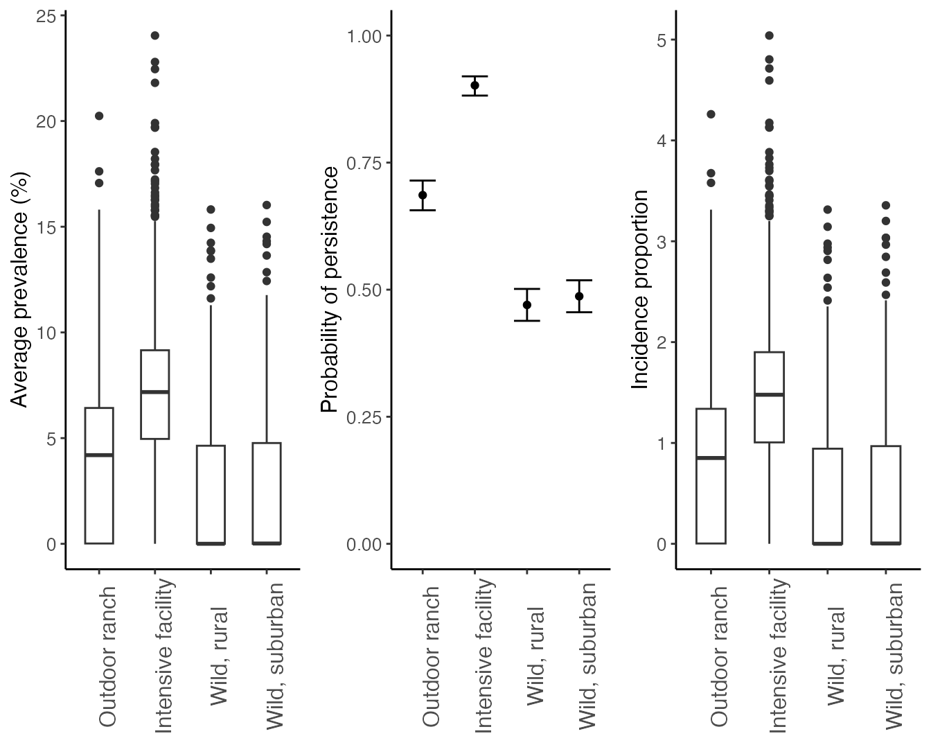
Plot interaction between FOI and \(R_0\) influencing prevalence, persistence, and incidence proportion
We summarize how how Force-Of-Infection from humans to deer (\(FOI_{HD}\)) and SARS-CoV-2’s basic reproductive number (\(R_0\)) interact in outbreak characteristics. The code below produces Figure 5 in Rosenblatt et al. In Prep.:
#Composite plot showing how R0 and FOI interact to impact prevelence
df %>%
  mutate(., r0_bin = case_when(r0 <= 1 ~ "Unsustained spread",
                               r0 > 1 & r0 <= 3 ~ "Low spread",
                               r0 > 3 & r0 <= 5 ~ "Medium spread",
                               r0 > 5 ~ "High spread"),
         r0_bin = factor(r0_bin, levels = c("Unsustained spread","Low spread","Medium spread","High spread"))) %>%
  ggplot(., aes(log10(FOI),Prevalence*100))+
  geom_point(aes(color = Context))+
  facet_grid(.~r0_bin)+
  scale_color_manual(values = c("black","gray80", "#66A61E","#66D61E"))+
  stat_smooth(method = "glm", method.args = list(family=quasi(link='log')), formula = y~x, color = "black")+
  scale_y_continuous(name = "Average prevalence (%)", limits = c(0,20))+
   scale_x_continuous(name = "Introduction hazard from humans (log10 FOI)", breaks = c(-9,-6,-4))+
  theme_classic()+
  theme(strip.text = element_text(size = 12),
        axis.text.x = element_blank(),
        axis.title.x = element_blank(),
        axis.title.y = element_text(size = 12),axis.text.y = element_text(size = 10), legend.text = element_text(size=10), legend.title = element_text(size=12)) -> Prevalence.plot

df %>%
  mutate(., r0_bin = case_when(r0 <= 1 ~ "Unsustained spread",
                               r0 > 1 & r0 <= 3 ~ "Low spread",
                               r0 > 3 & r0 <= 5 ~ "Medium spread",
                               r0 > 5 ~ "High spread"),
         r0_bin = factor(r0_bin, levels = c("Unsustained spread","Low spread","Medium spread","High spread"))) %>%
  ggplot(., aes(log10(FOI),as.numeric(Persist)))+
  geom_point(aes(color = Context))+
  scale_color_manual(values = c("black","gray80", "#66A61E","#66D61E"))+
  facet_grid(.~r0_bin)+
  stat_smooth(method = "glm",method.args = list(family = "binomial"), se = F, color = "gray20")+
  scale_y_continuous(name = "Probability of persistence", limits = c(0,1), breaks = c(0,1))+
   scale_x_continuous(name = "Introduction hazard from humans (log10 FOI)", breaks = c(-9,-6,-4))+
  theme_classic()+
  theme(strip.text = element_text(size = 12),
        axis.text.x = element_blank(),
        axis.title.x = element_blank(),
        axis.title.y = element_text(size = 12),axis.text.y = element_text(size = 10), legend.text = element_text(size=10), legend.title = element_text(size=12))  ->  Persistence.plot

df %>%
  mutate(., r0_bin = case_when(r0 <= 1 ~ "Unsustained spread",
                               r0 > 1 & r0 <= 3 ~ "Low spread",
                               r0 > 3 & r0 <= 5 ~ "Medium spread",
                               r0 > 5 ~ "High spread"),
         r0_bin = factor(r0_bin, levels = c("Unsustained spread","Low spread","Medium spread","High spread"))) %>%
  ggplot(., aes(log10(FOI*100),Cumulative_infections))+
  geom_point(aes(color = Context))+
  facet_grid(.~r0_bin)+
  scale_color_manual(values = c("black","gray80", "#66A61E","#66D61E"))+
  stat_smooth(method = "glm", method.args = list(family=quasi(link='log')), formula = y~x, color = "black")+
  scale_y_continuous(name = "Incidence proportion")+
scale_x_continuous(name = "Percent susceptible deer infected by humans per day (FOI; log-10 scale)", breaks = c(-9,-6,-3,-1))+
  theme_classic()+
  theme(strip.text = element_text(size = 12),
        axis.title.y = element_text(size = 12),axis.text = element_text(size = 10), legend.text = element_text(size=10), legend.title = element_text(size=12)) -> Incidence.plot

ggpubr::ggarrange(Prevalence.plot, Persistence.plot, Incidence.plot,nrow =3, ncol=1, common.legend = T)+
  annotate("label", x = 0.1, y = .85, label = "A", fill = "white", size = 6) +
  annotate("label", x = 0.1, y = .55, label = "B", fill = "white", size = 6) +
   annotate("label", x = 0.1, y = .25, label = "C", fill = "white", size = 6)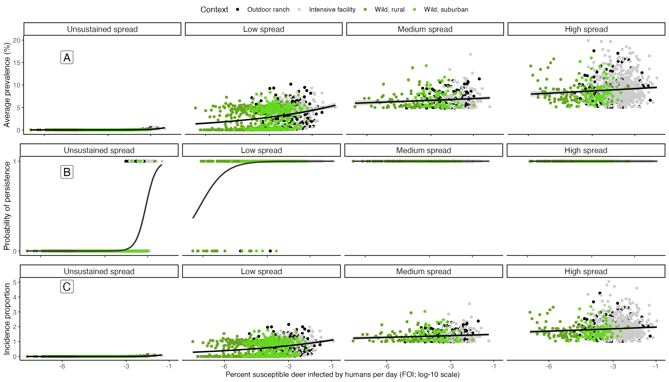
Plot comparison of continuous introduction from humans and a single introductory event
Here, we visualize differences in outbreak characteristics when there is continuous transmission from humans (as all cases plotted above) vs when there is a single, initial outbreak of various sizes. These initial outbreaks range from in 0.1% (1:1,000 deer), 0.0001% (1:1 million deer), and 1e-7% (1:1 billion deer). These initial outbreak simulations come from the vignette demonstrating how to model outbreaks from a single, initial introduction. The resulting figure corresponds with Figure 6 in Rosenblatt et al. In Prep.
whitetailedSIRS::scenario_results %>%
   mutate(., intro = "Continuous\nintroduction") %>%
   select(., -r0, -FOI) -> continuous

whitetailedSIRS::initial_infection_results_1_in_1000 %>%
   mutate(., intro = "0.1%\ninitially infected") %>%
   select(., -r0) -> initial_high

whitetailedSIRS::initial_infection_results_1_in_1mil %>%
   mutate(., intro = "0.0001%\ninitially infected") %>%
   select(., -r0) -> initial_med

whitetailedSIRS::initial_infection_results_1_in_1bil %>%
   mutate(., intro = "10e-7%\ninitially infected") %>%
   select(., -r0) -> initial_low

rbind(continuous, initial_high, initial_med, initial_low) %>%
   mutate(intro = factor(intro, levels = c("Continuous\nintroduction","0.1%\ninitially infected", "0.0001%\ninitially infected", "10e-7%\ninitially infected")),
          Cumulative_infections = Cumulative_infections)-> spillover.df

spillover.df %>%
   ggplot(., aes(x = intro, y = Prevalence))+
   geom_boxplot(width = 0.5)+
   facet_grid(Context ~.)+
   scale_y_continuous(name = "Average prevalence (%)")+
   theme_classic()+
   theme(axis.title.x = element_blank(),
         strip.background = element_blank(),
         strip.text.y = element_blank())-> spillover_prev_plot

spillover.df %>%
   group_by(Context, intro) %>%
   summarize(., LCL = binom.confint(x = sum(Persist),n = nsamples, methods = "exact", conf.level = 0.95)$lower,
             mean = binom.confint(x = sum(Persist),n = nsamples, methods = "exact", conf.level = 0.95)$mean,
             UCL = binom.confint(x = sum(Persist),n = nsamples, methods = "exact", conf.level = 0.95)$upper) %>%
   ggplot(., aes(x = intro, y = mean))+
   geom_point()+
   geom_errorbar(aes(ymin = LCL, ymax = UCL), width = 0.5)+
   facet_grid(Context ~.)+
   scale_y_continuous(name = "Probability of persistence")+
   theme_classic()+
   theme(axis.title.x = element_blank(),
         strip.background = element_blank(),
         strip.text.y = element_blank()) -> spillover_presist_plot

spillover.df %>%
   ggplot(., aes(x = intro, y = Cumulative_infections))+
   geom_boxplot(width = 0.5)+
   facet_grid(Context ~.)+
   scale_y_continuous(name = "Incidence proportion")+
   theme_classic()+
   theme(axis.title.x = element_blank()) -> spillover_cumulative_plot

ggpubr::ggarrange(spillover_prev_plot, spillover_presist_plot, spillover_cumulative_plot, ncol = 3)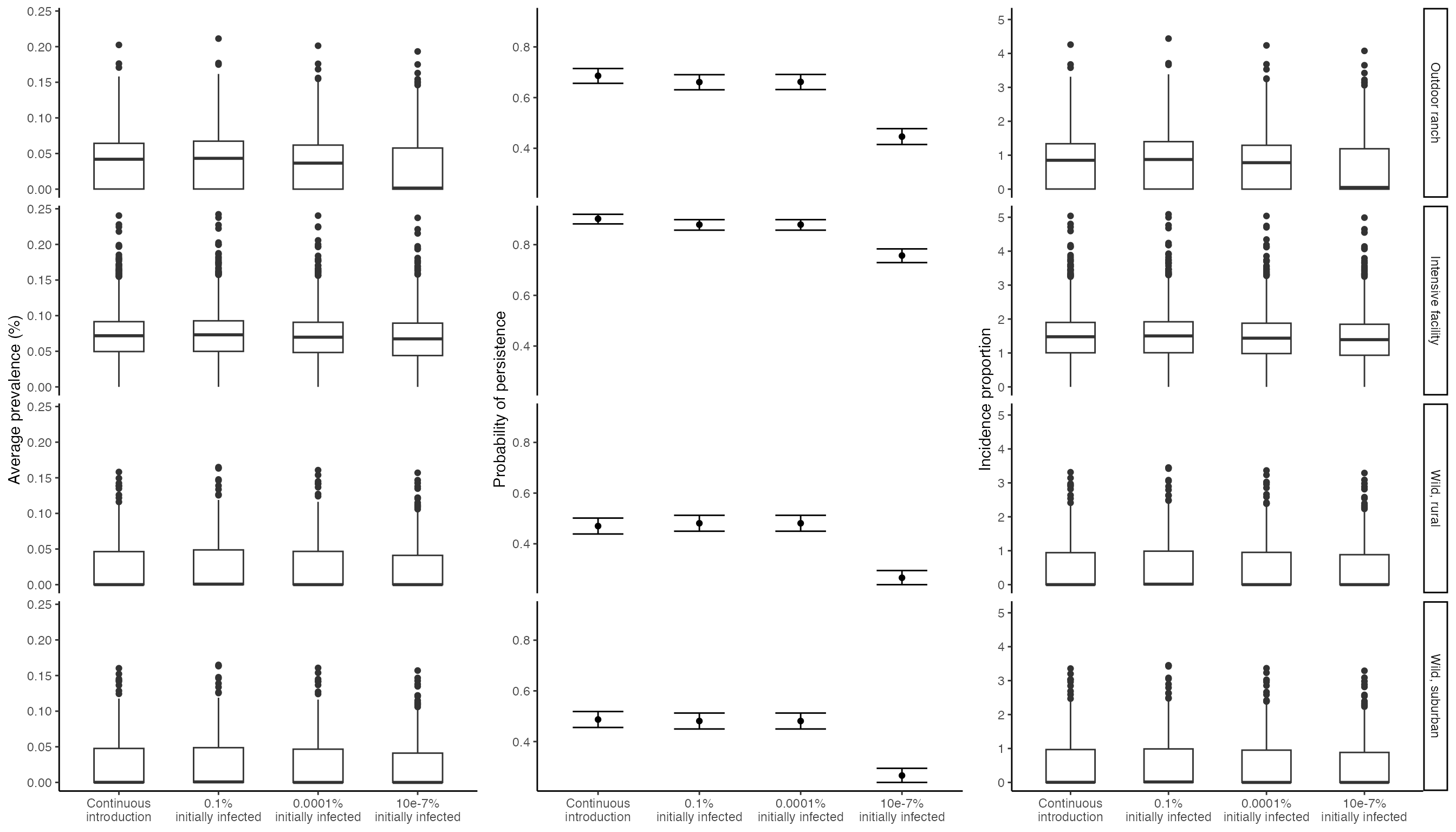
Next Steps
This vignette detailed comparing outbreak dynamics from different captive and wild scenarios. The next vignette looks at how to simulate outbreaks that could transmit between wild and captive scenarios via fence line interations.
Literature Cited
- Rosenblatt, E., J.D. Cook, G.V. Direnzo, E.H.C. Grant, F. Arce, K. Pepin, F.J. Rudolph, M.C. Runge, S. Shriner, D. Walsh, B.A. Mosher. In Prep. Epidemiological modeling of SARS-CoV-2 in white-tailed deer (Odocoileus virginianus) reveals conditions for introduction and widespread transmission.